03 - Time Series Analysis
Measurements arrive as dates and values in a file, and almost nothing can be done with them in that form: a date is not a number, so it cannot be an axis, an interval or a term in an expression. This example reads two such files and turns them into something a model can use.
It is also the first example here with no function and no parametric study. The data comes from a file rather than a computation, and the rest of the project treats it exactly as it would treat computed results.
The two files
Both are tab-separated, one row per observation, with the series name in the first column.
observationDataTransient.tab is piezometric head: ten wells, Well_1
to Well_10, about 1250 readings between 774 and 784 m. Nine of them were
measured roughly monthly from late 2007 to early 2017; Well_10 goes back
to August 1986.
Name      DateTime      Head
Well_1    01/11/2007    779.92
Well_1    28/11/2007    780.025
...
flowRateData.tab is recharge: four series, eleven readings in all,
between November 2007 and June 2011, at intervals from weeks to years.
Name          ShortDate     flowRate
recharge_1    01/11/2007    0.00430492
recharge_2    24/01/2010    0.000305194
...
Each file is read by a Spreadsheet Collection Import, which scans it, detects its columns and makes them a table in the project.
From dates to numbers
A Time Series Analysis turns one of those tables into a series. It is told which column means what, using expressions over the imported columns:
Setting |
Head series |
Flow series |
|---|---|---|
Name |
|
|
Date |
|
|
Value |
|
|
The two files name their columns differently, and nothing had to be renamed for that: the analysis is pointed at whichever column holds the date.
The rest is the conversion itself. The date format is dd/MM/yyyy, the
reference date is 1 January 1986, and the target unit is days. Every
observation then also carries a plain number – days since the reference date
– which can be plotted on a linear axis, compared, subtracted, or used in an
expression like any other value.
The reference date is chosen to sit before the earliest observation in the
project, which here is Well_10’s in 1986; everything measured after it is
then a positive number of days. Choose one and use it across the project.
It is the origin of every time axis in it, and two series measured against
different origins cannot be compared.
The name column splits the rows into one series per well or per recharge point, so the ten wells in one file become ten series the project can address separately.
Resampling the flow data
The flow series gets one step the head series does not. Its readings are spaced from weeks to years apart, so it is interpolated onto a regular grid:
interpolation times = range(7900, 9400, 100)
– sixteen points every 100 days from day 7900 to day 9400 after the reference date, that is from August 2007 to October 2011.
The interpolation is mass conserving: the total carried by the series is the same before and after it, rather than the rate being averaged point by point. For a flow rate that is the property that matters, because the quantity with physical meaning is the volume – the rate integrated over time – and an interpolation that treats the rate as an ordinary signal does not preserve it. Use it for anything that is a rate of something; plain interpolation is right for a state such as a head.
The grid is given explicitly, and the same grid is used for every series in
the analysis – so it also decides what is kept. A reading outside the
window does not reach the result, and nothing says so: the series simply
comes out shorter, or does not come out at all. The window here runs to
day 9400 because the last reading in the file is from June 2011, and an
earlier end would have dropped recharge_3 and recharge_4 whole.
Check an interpolation range against the span of the data, not against the
series you happen to be looking at.
The plots
Both plots were made as quick results: a time series knows how it wants to be drawn, so asking it for a time plot produces a configured plot in one step instead of one built trace by trace.
A quick time plot shows one series at a time. It puts a local selection
on the name column and starts on the first value it finds, and its title is
the expression Time evolution of #name#, so the heading always says which
series is on screen. Changing the selection moves the plot to another well –
the same mechanism as the slice in 01 - Function Surface Drawing, used here to
pick a series rather than a slice of a grid. Only the y-axis titles were set
by hand afterwards.
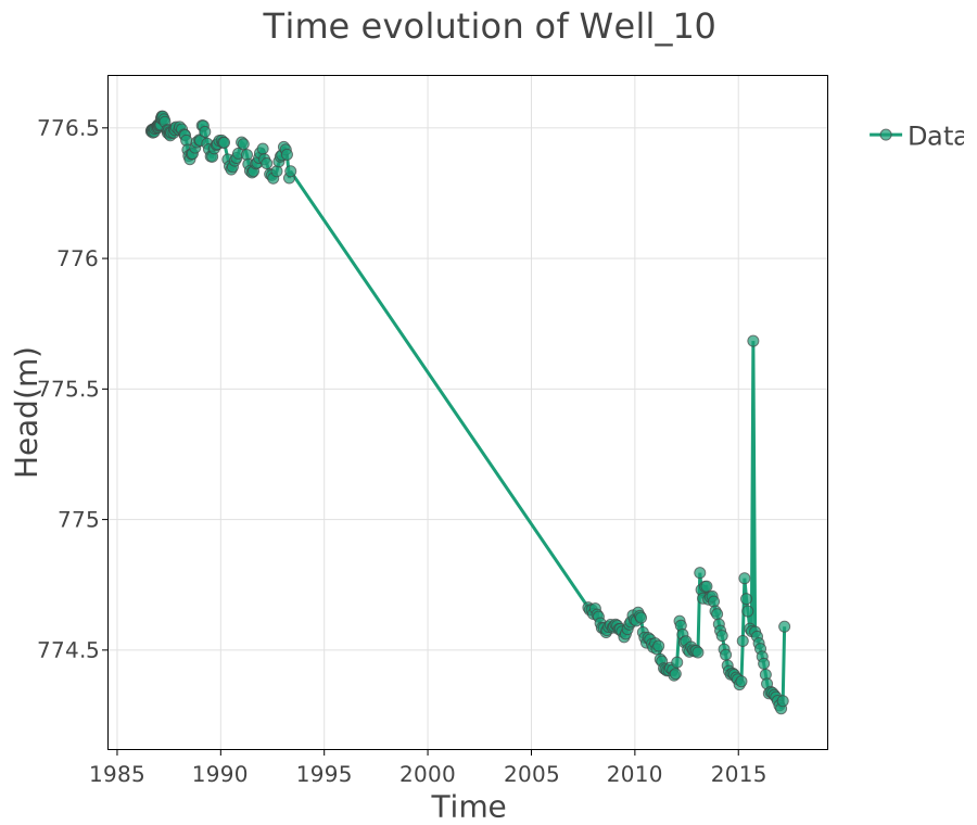
Well_10, the longest record: 210 readings from 1986 to 2017, where
the other nine wells begin only in 2007. The seasonal rise and fall is
clear against a slow trend, and the span is what the 1986 reference date
was chosen for. Select another well to see it instead; the title
follows.
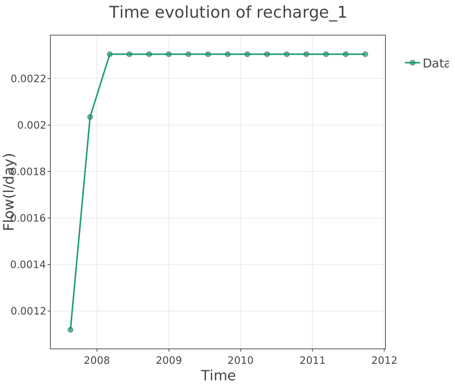
recharge_1 after interpolation: the sixteen points of the grid, not
the three readings the file holds for it. The conserved total is what
the resampled series has in common with the original.
Try it
Switch the head plot to any of
Well_1toWell_9and compare their ten years withWell_10’s thirty.Change the target unit from days to years. The axis rescales and every expression that uses the time value follows.
Narrow the interpolation window to
range(7900, 9000, 100)and watchrecharge_3andrecharge_4vanish from the result without a word.